Are there any plans or ongoing developments to improve the LimeSuite GUI?
Currently I see following major issues:
somewhat chaotic arrangement of panels and GUI elements
large window (needs scrolling on smaller screens)
lots of checkboxes
undescriptive labels (sound a lot like pin names of PCB or variable names)
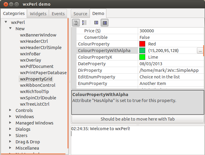
I think the GUI would be much nicer if it would look somewhat like this instead:
The current tabs and the included panels could be arranged in a tree like navigation like seen on left of the screenshot to declutter the interface. The properties can be represented as a wxPropertyGrid or even better a wxPropertyGridmanager which “is an efficient multi-page version of wxPropertyGrid, which can optionally have toolbar for mode and page selection, a help text box, and a header” (according to wx docs) like seen in the right part of the screenshot.
The good thing about the wxPropertyGrid is that it supports different value types like booleans (for checkboxes), numbers, categories, multi choices etc. The bad thing is that it seems it’s not very well supported in wxFormBuilder (the tool which is apparently used to design the GUI).
What do you people think? Is that a good future design for the GUI and what other improvements could be done?
I already started to learn how the GUI part of the source codes works and contributed small fixes, but I’d like to learn more how and what can be changed to improve the interface.
Have properties that are very commonly changed all on the main screen together, functionally rather than architecturally.
The detailed screens can still include the common functions but you would not need to jump around so much.
Have that single screen separate into Channel A and B if so selected so you wouldn’t forget which one you are working with.
I would agree that there is room for improvement — which is not a criticism of the engineers who work on it, as what you can see is only the tip of the iceberg when it comes to projects they’re working on.
As for improvement details, I’d take advice from @joshblum on this, as he has a lot of experience with GUI design (and I think Pothos GUI looks pretty great).
Have a graphic screen with the signal path elements displayed block schematic fashion with common settings adjustable. When you click on an element you get a pop-up of that element with detailed settings displayed schematically, or whatever is appropriate.
How sweet would that be?
Hello,
May I suggest to add a button to duplicate the setup from one way to the second. Should allow to gain on time setup and avoid any forgetting.
Or may be there is a trick to do that ?
Regards
Some pretty cool ideas here, just brain dumping here myself:
I like the high level system diagram (of LML/baseband/rf sections) with either controls or shortcut to the corresponding properties tab. That might be better than even a properties tree
A common properties tab for the most used controls. We want the high level controls accessible in one place. Assuming that many of the options in the other tabs are just considered for advanced use, tweaking, debugging.
Better presentation for channels A and B. Like showing both sets of controls change in lock step, or greying out unused channel controls, manual overrides for both channels, or resyncing settings from A -> B.
I could definitely see the first two options being combined in some way